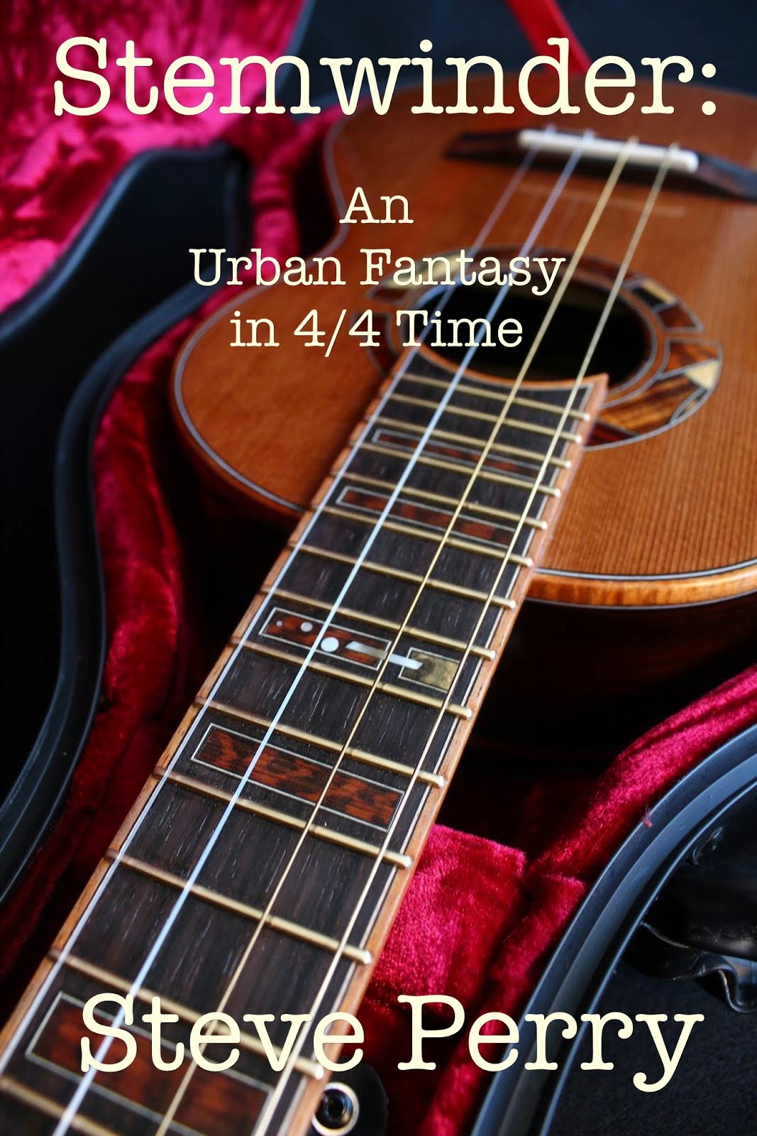
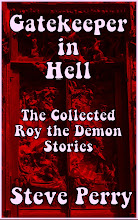
 And remember that people shopping on their Kindles will get grayscale-only, like the above.
 Perhaps this version, just above? I like the lettering the way it is, but I did add some texture and shifted the color toward the red. I don't think a thumbnail is going to let anything else show up, so no more illustrations or wording.
 Whaddya think? Those of you who read the early draft, does the image convey enough about the content? I've been working on the ms, went through and cut about 3500 words to speed it up, killing my favorite darlings ...
I did this because I might go the ebook route, since it doesn't seem to be finding a home in paper.
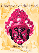
For the design, I found a public domain image, altered it, tweaked this and that, and it seems good for what I want. The font is Herculanum -- I like the way it stretches out the letter "A."
When you do something like this, you have to consider not only at what it would look like as a traditional cover, but how it's going to look as a thumbnail, which is how it will be posted on most ebook markets.
Brave new world out there ...


11 comments:
I like it. It fits the book well and it looks good. I shrunk it down and it catches the eye as a thumbnail too.
I really enjoyed the draft!
It needs either a softer yellow, a gradation of some sort (circular, maybe?), or more stuff in the background. As is, it looks like a page proof. I'd personally split the title up differently, too. It doesn't flow on the page well. That being said - it's not going to be on my bookshelf, so I can cope.
Heck, ask people here to design something based off your original. I don't have any skill in it or I'd offer, but I've seen a lot of book covers in my day.
I like Herculanum, and have used it for titling in the past --- but in small doses --- very small doses.
Also, the ``A'' form is an alternate which should only be used as needed to even out spacing or other occasions when the design calls for it --- too much of a good thing to use that form for every instance.
I'd suggest setting everything other than the title in something more readable and better suited to smaller settings, then re-space the title text and see which alternates are appropriate to use where --- sometimes one can manage to not duplicate any letterforms and get everything to tie together nicely as well.
Agree w/ Michael that some sort of background or texture so as to place things would be an idea to consider.
William
Also, re-arrange the text for hierarchy and readability --- probably you'll need to reduce the image for that.
No. It needs something mundane as well to convey that it is urban fantasy. Most urban fantasy have a 'normal' setting with a fantastic element, character, or action.
Call me strange but I like the first one the best - the colors just start getting a bit much for me in the others, but that's just my opinion.
So, I'm piggy backing on others comments a lot but...
I would set the "A Buddhist martial Arts novel" into a more standard font. Break it up a bit and makes it seem distinct from the title and author info.
I like the gray scale image (I'm now a nook user myself, despite a long standing anti-technological bent but generally shop off of the computer so color images are what I mostly see). I do also like the color covers. The colors are a bit much to stare at, but potentially great as an eye-catcher.
The cover as whole makes me think retro/pulp novel (which is a good thing).
E-bookery is a strange critter, and the covers have less function than they do on paperbacks or hardback dust jackets.
The function of a cover is to get a potential reader to pick up a book and open it. It's nice if the cover has something to do with the content, so the reader doesn't feel cheated when he thinks he's getting a pulp genre potboiler and it turns out to be a mainstream conflicted lesbian romance novel, but it's not really necessary.
If yon cover causes a browser to pick up the thing and open it, then it's the writer's responsibility to take it from there. If I can't hook you on the first page or two, that's my fault. The cover won't save me.
With ebooks, readers don't get to pick up the novel. Most of the catalogs give you a thumbnail, and you can expand the image, so it needs to look okay at full size, but since most of the epubs allow a download of a partial -- usually 15-25% of the content -- then the cover just needs to do the same thing. (How it has less function is that it won't be sitting on a shelf, so once the book gets bought, the cover doesn't show. The image might be with the file -- some are, some aren't -- but nobody save the people who use that reader's hardware will ever see the cover.)
I wanted a Tibetan Buddhist demon mask because that's the hook -- a guy what schleps dead souls through eighteen hells to be reborn. I want "Buddhist" and "Martial Arts" together because they don't normally go together. Buddhists might be intrigued; so might martial artists. People who know about both probably will be curious.
The font stays the same because back in the day when we were laying out my wife's newspaper, the friendly folks who brought us PageMaker were quick to point out that people who went into font-frenzy and started mixing and matching because they could, looked like amateurs, and usually were. If you are going to offer more than one on a cover, they need to be in the same family -- no sans serif next to the Times Roman next to the American Typewriter. What matters is that I spell my name right ...
Bourgon has the right idea. This is definitely an opportunity for "crowd-sourcing."
I suspect you would get some things you're really happy with if you open it up to the fanbase. And it has a nice blowback effect of viral marketing.
Too many buzzwords? Basically, if a bunch of people participate in the process they feel ownership and a need to share with others. Good for you. Good for sales.
The problem is you're perpetuating one of the other classic naïve font mistakes --- over-using a decorative font (and as I noted, you're even over-using alternate letterforms in the font --- try limiting the slanted ``A'' to only the word ``DEAD'').
There's also no sense of flow for the text or hierarchy in terms of what order to read things and the line break in the title is badly placed --- if it even needs to be there at all.
If everything which you're invested in in the cover design is set in stone, why ask for commentary?
William
(who does this for a living and has won design awards)
Listen to William. He's got the professional, clinical eye on this. I'd also suggest shrinking the picture a bit. One of the reasons the text doesn't flow is it's crowded out.
Post a Comment